How UX/UI Designers Align Business Goals with User Needs
By Bond Nguyen, Senior UX/UI Designer at Groove Technology
Over time, I’ve learned that designing software is about more than just functionality. It’s about creating experiences that users genuinely enjoy while helping the business meet its goals. Balancing what users need with what the company wants to achieve can be challenging, but that’s also where the excitement lies. The question is: how do we strike the right balance?
In this article, I’ll explore key strategies for bridging the gap between user needs and business objectives. Drawing from my own experience on various software projects, I’ll share practical tips that can help designers discover new insights and apply them to their own work.
01. User Research: The Foundation of Every Great Design
Whenever I start a new project, the first thing I ask myself is: Who are the users? What are their goals, frustrations, and pain points? It might sound obvious, but I’ve seen projects fail because the design didn’t fully consider the users’ needs. Skipping or rushing user research almost guarantees that the final product won’t resonate with its audience.
To gain a deeper understanding of user behavior, I frequently turn to platforms like UX Tools and UX Archive or even Google, where I explore similar case studies and design solutions that cater to specific behaviors. These insights help inform my design approach and ensure it’s user-centered.
For surveys and collecting user experience, I use Google Form and Hotjar to reach a broader audience. I also rely on Google Analytics to study user behavior on existing products, providing quantitative data that helps identify pain points or areas for improvement. Collaborating with a Business Analyst can further refine these insights, ensuring that the research is aligned with project goals.
Practical Tip: Start Early and Dig Deep
Don’t wait until the design phase to start thinking about the user. Get involved early in the discovery process and immerse yourself in understanding who your users are. A common mistake I’ve seen designers make is assuming they know the user’s needs based on previous projects or general trends. Every project is unique, so take the time to learn about this particular audience.
For example, when I worked on a mobile app for elderly users, I didn’t rely on assumptions. Using tools like UserTesting, I conducted interviews and observed how they interacted with similar apps. This process uncovered specific needs, like larger fonts and simpler navigation, that made a huge difference in the final product.
02. Balancing User Needs with Business Goals
Designing with the user in mind is important, but so is aligning your design with the business’s goals. Often, users want simple and easy, while businesses aim for engagement, retention, and conversions. The trick is finding a way to achieve both.
Example:
One of my projects involved adding customization features to user profiles. The business wanted a lot of data from users, but our research showed that the target audience (busy professionals) didn’t want to spend time on complicated customizations. So, I simplified the process by introducing pre-set templates. This gave users a quick way to customize while still allowing the business to gather valuable data.
Common Mistake:
It’s easy to overcomplicate things when trying to meet business needs. But the best approach is to keep it simple. Focus on the key goals and prioritize the features that will both serve the business and keep users engaged without overwhelming them.
03. Making Complexity Feel Simple: The Power of Intuitive Design
Users expect things to be easy and intuitive. When designs are too complicated or hard to navigate, people get frustrated and leave. A big part of our job is to take complicated features and make them feel straightforward.
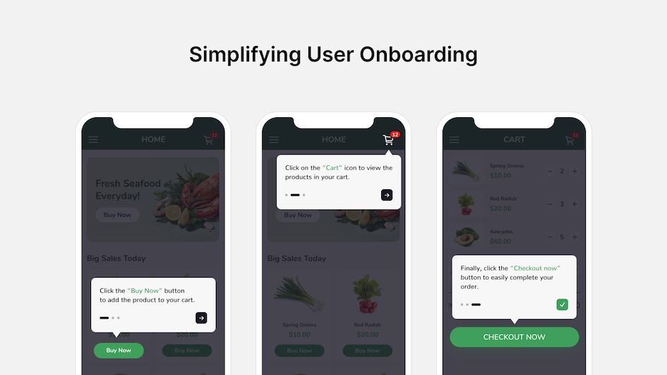
Example: Simplifying User Onboarding
I once worked on a project where the onboarding process was really complicated—too many steps and too much information all at once. To fix this, we broke the process into smaller, manageable steps. We added little in-app tutorials and tooltips to guide users through the process. This change made onboarding smoother and led to better engagement.

Tip:
Whenever you’re designing something new, think like someone who’s seeing it for the first time. Is it clear? Is it easy to follow? If you’re unsure, test it with new users!
04. Accessibility: Designing for All Users
Accessibility is an area I’m passionate about. It’s not just about designing for the average user, but for all users, including people with disabilities, the elderly, or those using different devices. Accessibility should never be an afterthought—it should be baked into the design from the very beginning.
Practical Example: Designing for Elderly Users
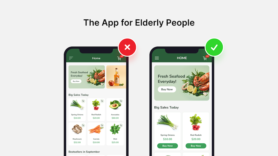
In one of my projects, I worked on software aimed at elderly users. During the research phase, I identified several accessibility challenges. Many elderly users struggled with small text, poor contrast, and overly complex navigation.
To address this, I made sure to use large, clear fonts, high contrast between text and background, and designed a simple, linear navigation path. I also added features like voice commands and fingerprint login to make the experience as seamless as possible.

Practical Tip: Follow Accessibility Guidelines and Test
There are well-established accessibility guidelines that can help you ensure your designs are inclusive. However, guidelines are just the foundation. Testing your design with real users who have accessibility needs is critical to ensuring your product works for everyone.
05. The Importance of Iteration and Feedback
Design is never a one-and-done process. After launch, users interact with the product in ways you might not have anticipated. Gathering feedback and making improvements based on that feedback is a key part of creating a successful design.
Example: Improving Navigation Through User Feedback
After launching a mobile app, users found some parts of the navigation confusing. Instead of sticking to the original design, we gathered feedback from the users and made adjustments. The changes led to smoother navigation and higher engagement.
Remember:
Listen to your users. Their feedback is invaluable and can guide you to create better experiences. Simple usability tests can help you run A/B tests and try out new ideas to see what works best.
Conclusion: The Strategic Role of UX/UI Designers
UX/UI designers aren’t just creators—we’re problem-solvers. We help connect user satisfaction with business success by understanding people’s needs, simplifying complex tasks, designing for accessibility, and iterating based on feedback.
I hope the lessons and tips I’ve shared here give you some useful insights you can apply to your own projects. Every project is an opportunity to learn more about your users and create something that makes a difference.
If you have any questions about the role of a UX/UI Designer in software development, feel free to reach out at contact@groovetechnology.com
Bond Nguyen is a Senior UX/UI Designer at Groove Technology, specializing in creating user-centered designs that effectively balance business goals with user needs.


